Publishing Design
Rafa Maritza Hertrian [0364958]
Bachelor of Design (Honours) Creative Media/ Taylor's
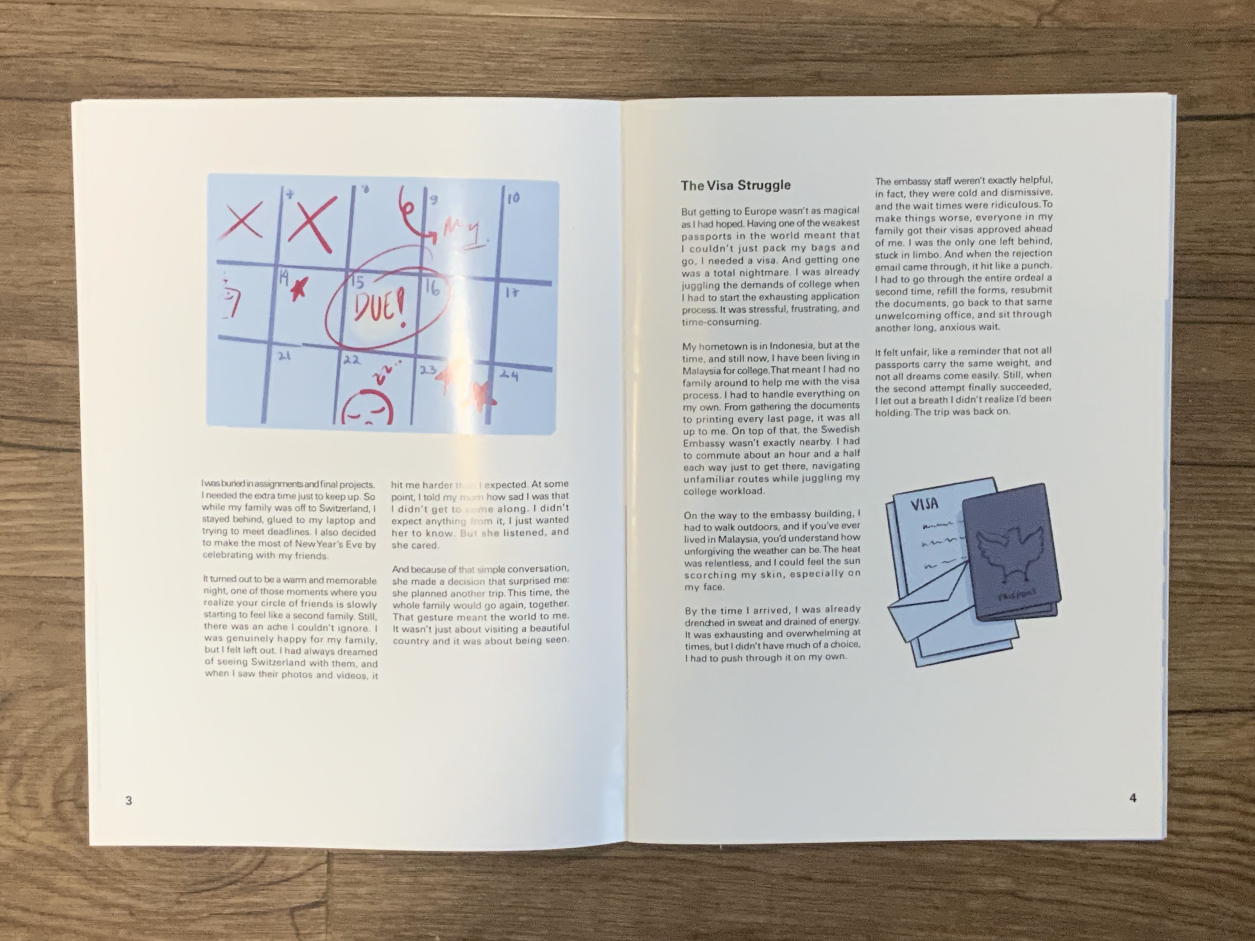
University
GCD 61404/ Publishing Design
LECTURE
Week 1: Formats
The book: Although publishing includes a variety of formats, such as books,
newspapers, and magazines, books are the specific emphasis of this
semester because of their historical and significant influence. Books
are essential for recording and disseminating history, ideas, and
knowledge. Typography, spatial awareness, attention to detail, and
understanding of publishing software are all necessary while designing
a book.
What factors determine format?
size of the person who will read the book. For Example, if the book
is for kids, don't make it big.
The content: Consider a larger book size if the content is
large.
Format consists: the binding, paper, and size.
Historical Formats: Their uniqueness and the possible reasons of
their decline
1. Iran-Iraq: Mesopotamian
2. Egypt: Ancient Egyptian Civilization
3. India-pakistan-afganistan: Indus Valley
4. China: Han Chinese Civilization
5. Europe (Turkey & Beyond): European Civilization
Innovation almost always shadows technology. New technology creates
opportunity; if the technology has potency, it would have a cascading
effect on other areas of life.
Mesopotamia: The first writing mechanism was developed from counting
technology. It was developed from clay tablets to keep records of
things.

Indus River Valley Civilization: The writing cuneiform was the
earliest system of writing They used it to write records about
government, religion, and trade. They basically use pictures to
describe things on soft clay tablets.

800-900 BC: the start of writing using old stylus and palm leave.
Palm manuscript was common around south Asia like Nepal. However, the
records would not be visible in dry season. This method would not last
long, hence people had to rely on oral records.

Palm leaf manuscript Library

Palm leaf elaborate manuscript: Discovered in Nepal and preserved in
Cambridge University.


Egypt: It is the oldest civilization in the world, but it no longer
exists. The scribes were the only people who could write and read
hieroglyphics. they used special paper called papyrus (thick paper
from the papyrus plant) and also tomb walls.

Right-to-left hieroglyphic in cursive form of hieroglyphics. They
create this to write more efficiently. This is the evolution how
Arabic forms of writing. This is a document on how to treat illness by
doctors.

Han China: Early Chinese characters were written vertically. They
commonly use thinned bamboo strips. The earliest printed book in
Chinese, from the end of the T'ang Dynasty discovered in a cave at
Dunhuang. The paper is in a scroll format.

Printing from wood blocks: as in Diamond Sutra. It requires a lot of
labor, but the task is unavoidable until the creation of movable type.
Along the way, someone came up with a singular word. It was pioneered
in China but achieved in Korea. This is because China experimented
with clay or porcelain, which would not last long. Meanwhile, Korea
discarded the Chinese writing system and made themself reducing the
characters. They use brass metal to carve them per character, creating
a page.
Turkey and the West: Parchment was first invented in Turkey, made
from animal hide. With papyrus or bamboo, it was possible to make a
scroll, but this was not possible with parchment because it is too
thick. That its why scrolls are never adapted in the West, they can
form them into books instead. Books are expensive back then because
the process was too difficult.
The two leaves of parchment filled with "surprisingly legible" text
from Islam holy boo, have been carbon dated to close to the time of
the Prophet Mohammad.
Why is the paper folded into 16 pages:
IBC IFC FC BC
Bachelor of Design (Honours) Creative Media/ Taylor's University
GCD 61404/ Publishing Design


Week 2: History of Prints
The history of printing is important because writing has evolved over
time.
2nd - 8th century AD
The six main classics of Confucianism are carved in stone. Confucian
scholars eager to own these important texts simply lay sheets of paper
on the engraved slabs and rub all over them with charcoal or graphite,
taking away a text in white letters on a black background

Brass rubbing


Korea and Japan: AD 750-768

The world's earliest known printed document is a sutra printed on a
single sheet of paper in Korea, AD 750.

followed by Japan, in AD 768 in devoutly Buddhist Nara, the empress
commissions a huge edition of a lucky charm or prayer. This took
about 6 years to complete.

The Hyakumanto Darani, literally the one Million Pagoda &
Dharani prayers, is a famous large-scale woodblock
printing
The first printed book: AD 868
printed in China for the end of the T'ang dynasty. Discovered in a
cave at Dunhuang in 1899, it is a precisely dated document that brings
the circumstances of its creation vividly to life. It is a scroll 16
feet long and a foot high.
How did they read it? They probably roll one side of a
table.

Chinese Publishing: 10th - 11th century
Printing from wood blocks, like in the Diamond Sutra, is a work
that requires a lot of labour. Yet it is a successful work in China.
In the 10th and 11th centuries, the Confucian classics were
published for scholar officials.
Carving many characters in reverse on wood blocks is an investment
until movable type is introduced.
Movable Type
A technique that was discovered in China but pioneered in Korea. It
is a separate, ready-made character or letter that can be arranged
in the correct order and can be reused.
Two reasons why china didn't go along with the prints
1. Chinese script has too many characters
2. Chinese printers cast their characters in clay which is too
fragile
Type Foundry
In the late 14th century, the Koreans established a foundry to cast
movable type in bronze. Bronze is strong of repeated printing,
dismantling, and resetting for a new text.
At that time, Koreans used the Chinese script, so they had the
problem of an unwieldy number of characters. They solved this in
1443 by inventing han'gul.
Saints and Playing cars: AD c.1400
The technique of printing from a woodblock (from the east) is used
in Europe. In East, they lay a piece of paper on a carved wooden
surface. This was mainly used for printing holy images for sales to
pilgrims. While playing cards is something introduced by Western
trade.
Chinese Playing Card

Left: Chinese playing card found near Turfan
Right: Queen of Wild Men, ca. 1440, engraving by the master of
the playing cards with whom Gutenberg is thought to have
worked.

Gutenberg and Western Printing
Gutenberg has number of things he can do:
- metallurgy
- How to cast
- design letters
- How to make a press
- learned about paper
However, he lacks understanding of business, which led to his
founding to be taken by two of his business partners.
 Gutenbergs Achievements
1. Development of the printing press
2. Gutenberg's skill with metal enabled him to master the complex
stages of manufacturing individual pieces (he was a goldsmith,
hence the skill was retrieved from there)

He printed the bible

The world's Largest Book
Kuthow Pagoda at the foot of Mandalay
Each stone tablet has its own roof and precious gem on top in a
small cave-like structure (Stupa), there are 729 stupas and they are
arranged around a central pagoda

Week 3: Typo Redux
Typography: the art of composing and arranging text.
Characters in a typeface
- Small Caps: only used when there are lots of acronyms
- Numerals
- Fractions
- Ligatures
- Punctuation
- Mathematical signs
- Symbols
- Non-alignment of Figures

Ligatures: used in the past, so there are no clashes between the
letters in the Fs
Old-style numbers: the elegance does not apply to modern use,
such as for promotional numbers

Ligature only use in headlines because its hard to find the letters

Weights in a Typeface
Some designers use 2 different typefaces in a book, which is fine
but it is more difficult to find a suitable pairing.

Legibility
The goal is to make text more readable, then heeding established
legibility guidelines is important. The first step in making type
legible is to choose text typefaces that are open and
well-proportioned.

Well-proportioned typefaces


The world's Largest Book


INSTRUCTIONS
TASK 1: EXERCISES
Exercise 1 - Mockup: Book Sizes
We were instructed to create a book size that is smaller than
A4 but bigger than A5 following the tutorial from Mr. Vinod. He mentioned that the book size need to be based on the function of the book. For example, if the book is targeted to children, then it is better to make the book holdable for children. But for this exercise, I just experimented on different sizes.


Exercise 2 - Signature Folding System
I followed the tutorial from Mr. Vinod, too, for this exercise. This allows me to understand how the pages are ordered based on this folding system.


Exercise 3 - Van de Graff (Classical Grid System)
This is a manual method to determine the best margin to use in our book.


Exercise 4 - Determining Grids
After that, I experimented on different ways to use this grid.
Exercise 5 - Form and Movement
Trial (following the tutorial). For this exercise, we are told to experiment on making movement with elements within pages of the book.
The things I need to make - Using 1 color
- Using 2 Colors
- Using 2 colors and Images
- Using 2 colors, images, and text
1 Color

2 Colors

2 Colors + Image

2 Colors + Image + Text

Final LayoutWhen I showed this layout to Ms Vitiya, she said that she doesn't really like the color combination because the blue is making the red looks dull. She suggested since the image I'm using is already cool toned, I should use something warmer. Hence, I chose to incorporate blue in my layout.
- Using 1 color
- Using 2 Colors
- Using 2 colors and Images
- Using 2 colors, images, and text


TASK 2: CONTENT GENERATION
3000 Word EssayWe were instructed to write a personal story for at least 3000 words. I chose to write about my first time travelling in Europe.
VisualizationAfter creating the 3000 words story, we were told to take 16 contexts from the story and make illustrations for the book out of it.
Below are the final illustrations I did, but in Task 3, section, it can be seen how the illustration changes based on feedback.
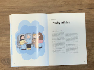
TASK 3: BOOK (A)
Draft 1
When making this draft, I felt like the movement was not really cohesive. I asked Ms Vitiya on how I can improve it. She suggested that I make the outline the same for each illustration, the background have to have the same style, and do not overlap the text and the image.
Draft 2From the feedback, I fixed the outlines. I made every illustration have a black outline. I also decided to make the background have a harsh vector style instead of giving some of them a watercolor texture background.
But after consulting with Ms Vitiya, she suggested the two illustrations below need to be improved. They were not really suitable for the rest of the pages. She also reminded me to fix the kerning.
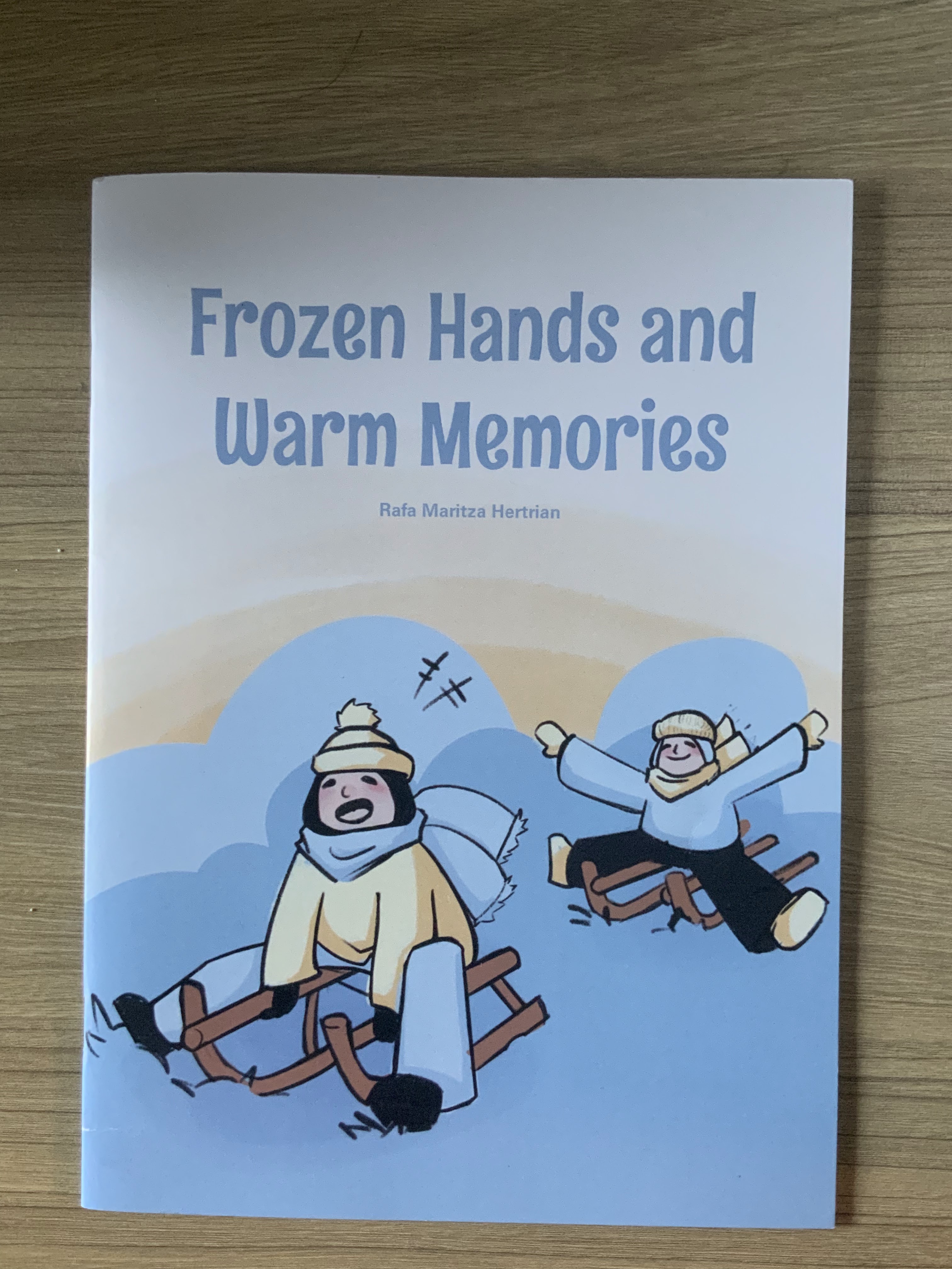
Draft 3For this draft, Ms Vitiya said that the flow is already nice and I just needed to make a few adjustments to the book cover.
Draft 4
Cover Page 1
First Physical Book Printed


After seeing the printed version of the book, I realized that I wasn't satisfied. I thought that the cover is not eye-catching enough, it seems pale and the title does not really match the cover illustration. After consulting with Ms. Vititya she also pointed out some mistakes that I made. Some of the fonts were not consistent, the page number is a lot bigger than the body text. She also suggested the title page be centered and aligned because it looked unbalanced.
After fixing the font size and alignment problems, I proceeded to fix my cover page. I made the coloring of the illustration more neat and also added saturated shadings to make it look more eye catching.

After that, I gave the title a bit of a style, change it to yellow, and added grainy texture which match the style of the illustration.

The change is very subtle but I prefer the new one a lot better.

Finally, I printed the book again but with a textured paper instead of gloss because it makes the book feels more nostalgic and comforting.
FINAL BOOK PDF
FINAL PRINTED BOOK


Making a Promotional PosterTo start making the poster, I put my book cover in book mockups to put in my poster.
Then, I proceed to make the poster design.
Poster Design Draft 1

Poster Design Draft 2

Poster Design Draft 3

Poster Draft 4 After consulting with Ms Vitiya, I realized that the promotional poster need to have a purpose. So I thought about a catchy phrase that might pull readers to read my book. Hence, I put a simple launching phrase and simply described that it is a winter themed book.
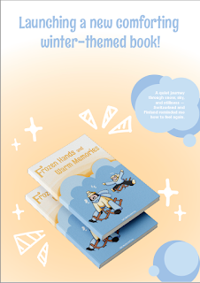
Final Promotional Poster Design

Week 13In week 13 we presented our book infront of the whole class.


.png)


FEEDBACK
Week 1Introduction to the module and Publishing
Week 2Task 1 Exercises
Week 3Checking the 3000 word essay for Task 2
Week 4 3000 word essay approved proceed with the exercises
Week 5Specific Feedback: The color in the movement practice is not really suitable, the blue turns off the red because it is too dull and the picture is already cool toned. Hence, Ms. Vititya suggested to replace the blue with warm color.
Week 6 Ms Vitiya said that the illustration color is a bit too childish. Hence, it is suggested that I tone down the blue a bit.
Week 7 - Standart line drawing - Standart line colour - Watch your flow of text overlapping the image: dark image and dark text
Week 8 Continue making the illustrations
Week 9 - Some of the illustrations is still not cohesive with the whole book. For example, there is one page that is way too dark than the other pages.- Make sure there are no orphans- Learn how to do the bleed, crop, and slug
Week 10- The cover page illustration is already good but the typography need to be more suitable for the whole illustration. - The kerning is still bad and needs to be adjusted.
Week 11Make Promotional Poster
Week 12- The page number is too big- The synopsis typography is not consistent - The title page is not centered alligned- Some of the kerning is either too tight or too loose- You need to ensure the purpose of the poster to the audience
REFLECTION
Experience
This module is both fun and challenging. I enjoyed receiving new knowledge on how to publish since Ms Vitiya also mentioned that this is a skill that not a lot of people have pursued. I also liked that we have the freedom to choose our own style of our own book, while also expressing our personal story in the book. Overall, the book felt very personal and fun. However, it was somewhat frustrating because the process is very long, starting from writing the whole story, making the visualization, and thinking of the layout. This module is definitely not easy, but it has taught me a lot.
Observation
When I was collecting the visualization for my book, I felt like my pictures aren't good. Hence, I decided to just draw them, but I realized how much time it would take for me. So to make the process easier, I narrowed my color palette and have 3 main colors so that I don't have to waste time choosing colors that is suitable for my design.
Findings
To make a picture book look cohesive, we need to design the movement beforehand. This can be achieved by applying the same element, such as color or shapes, throughout the pages. The cohesiveness of your design can be checked through a compressed file that shows all of the pages of your design side by side.

Comments
Post a Comment