Major Project 1 | Task 2: Design Preposition

Task 2: Design Preposition
Week 4 - Week 5 |
Rafa Maritza Hertrian [0364958]
Bachelor of Design (Honours) Creative Media/ Taylor's University
[PRJ64904 Major Project 1]
[PRJ64904 Major Project 1]
Links:
INSTRUCTIONS
PROCESS
4.1. Week 4
We surveyed potential customers interested in our product and asked
people about a suitable presentation. This will help us improve our idea
and understand our target audience. Below are the questions that we
raised in our survey and the responses.
Link to Survey: https://forms.gle/QYRrfq3J2dx5N7GN9


Figure 4.1.1 Survey Responses
Finalizing Game System
This week, we tried to focus on finalizing the game system, so we
played the game using sketch and paper. We made a couple of adjustments,
such as revising the board so that it would be more suitable for the
duration of the game. We also decided to increase the maximum number of
gamers from 5 people to 8 people because we thought that the game would
run better if there were more players. We also decided to exclude
several cards because we're afraid that it might be confusing for the
players. Finally, the game is only gonna have 3 different cards, role
cards, minigames, and heal cards. We also changed the placement of some
board items to make it more suitable for the game length. For example,
discussion time will only be 2 times and placed near the end of the
game. This way, incase the players guessed correctly, the game wouldn't
end too soon.

Figure 4.1.2 Trying the game

4.2 Game System ver 2:
Roles:
4.2 Game System ver 2:
Roles:
-
Inspector: one person who doesn't actually get on the game but
controls how the game plays. (They will not win nor lose)
-
Suspect: one person that will play along with the players
pretending to be one of them and killing the people in the night.
(Will win if the suspect succeeds in killing most of the players
or reaches the end of the game)
-
Players: players will play and will try to figure out the suspect.
(they will win by reaching the end of the game or figuring out who
the suspect is)
Board System: To use this board game, the players will start the game
from the 'start' and also finish the game in the same block. To move,
the players will have to flip a coin, which will make players move
either 1 or 2 steps and keep playing until they win one.
Board Items:
-
Minigames: The players will draw the minigame card and will play
either Red Light Green Light, Dalgona, Gonggi, or Spiraling
top.
-
QnA: The player can choose someone else to ask one question about
their traits
-
Clue/hint: The inspector will describe one trait of the suspect to
the player.
-
Night time: Everyone will close their eyes, and the killer will be
summoned by the inspector to kill one person among the players.
The player chosen will get eliminated.
-
Discussion: This is the time when the players have to guess who
the suspect is. If they get the person, the person chosen will be
eliminated.
-
Jail: In jail time, the player will be skipped one round of the
game.
Cards:
-
Cards for players: show a character with specific traits
-
Minigames card: will show the type of game they will play, and
the guide to play the game)
-
Heal cards: they will win this by winning the minigames, if they
don't win, then they won't get the heal cards. This card can
protect the players at night.
- Inspector: one person who doesn't actually get on the game but controls how the game plays. (They will not win nor lose)
- Suspect: one person that will play along with the players pretending to be one of them and killing the people in the night. (Will win if the suspect succeeds in killing most of the players or reaches the end of the game)
- Players: players will play and will try to figure out the suspect. (they will win by reaching the end of the game or figuring out who the suspect is)
- Minigames: The players will draw the minigame card and will play either Red Light Green Light, Dalgona, Gonggi, or Spiraling top.
- QnA: The player can choose someone else to ask one question about their traits
- Clue/hint: The inspector will describe one trait of the suspect to the player.
- Night time: Everyone will close their eyes, and the killer will be summoned by the inspector to kill one person among the players. The player chosen will get eliminated.
- Discussion: This is the time when the players have to guess who the suspect is. If they get the person, the person chosen will be eliminated.
- Jail: In jail time, the player will be skipped one round of the game.
Cards:
- Cards for players: show a character with specific traits
- Minigames card: will show the type of game they will play, and the guide to play the game)
- Heal cards: they will win this by winning the minigames, if they don't win, then they won't get the heal cards. This card can protect the players at night.
4.3 Discussing Deliverables and Visual
After a discussion with Ms Vitiya, we realized we have to discuss the
visuals of the product. We have to make our own logo, determine the
color palette, art style, and typography. We also start on dividing work
for everything, such as the brand identity, the board design, the
instructions, and the card designs. I am responsible for the role and
heal cards.
 |
| Figure 4.3.1 Deliverable Discussion |
 |
| Figure 4.3.2 Card Style Discussion |
Color Palette
After the discussion with Ms Vitiya, we immediately decided on the color
palette, font, and style. We chose the color palette based on the
colorfulness of Squid Game mixed with eerie tones.
 | |
|
We chose to use pink and teal blue as the main colors because it's the most
eyecatching color.
 | |
|
For the font, we all agree that we should use a spooky-like font. Hence for
the main font, we found that Lacquer is suitable because it is handwriting
and the uppercase looks like dripping blood.
 | |
|
For the second font, we chose something that is more simple so it does not
take away the focus of the main font. We chose Faculty Glyphic as the second
font.
 |
| Figure 4.3.5 Font: Faculty Glyphic |
5.1 Week 5
After a discussion with my teammates, we agreed that the art style
for the player cards would be more suitable in a cartoonish style
since we also agreed on a semi-cartoony style for the game cards.
Hence, I proceeded to draw 8 characters in Procreate since we also
agreed that the number of players would be increased to 8 people so
that it would be harder to identify the suspect. The characters have
to have several traits that can be questioned during the game. I chose
glasses, grey hair, mole, gender, and batch to be the
traits. 


Figure 5.1.1 Player Card Illustration
Then I proceeded to create the layout for the player cards. For
this design, I was inspired by the player status that looks like a
rhombus in the series. So, I applied it to the player cards. All
of the characters have at least one similar trait to the suspect.
the suspect traits are male, o-batch, mole, glasses, and grey hair
so the players can ask for these traits. some characters are more
suspicious on purpose

However after consulting the design with my teammates, it turns
out that I had a bit of a misunderstanding. I thought that one of
the cards in the player cards was gonna be the suspect. But it
turns out that the suspect will be chosen by the inspector. So I
have to change the title of the player cards.
 |
Figure 5.1.2 Player Card Draft 1 |
Final player cards draft:
The player cards will contain the traits of the character the real
player will acquire so that they can describe their player if they are
questioned. This is important for the gameplay because there is a part
where the players are going to be questioned if they are suspects or
not.
 |
Figure 5.1.3 Player Card Draft 2 |
Figure 5.1.4 Player Card V1
Other than that, I also created the healing card. This is
important because the players will receive the healing card every
time they succeed in the minigames.
 |
Figure 5.1.5 Heal card Design V1 |
5.2. Works from my teammates
Brand Logo (By Carmen)
 |
| Figure 5.2.1 Logo Design V1 |
The concept of the logo: w-h is like killing and there's blood
dripping, starting I, the suspect is walking away
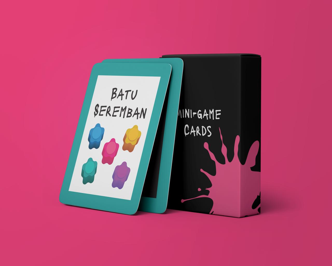
Minigame Cards (By Seoyoon)
 | |
|
 | |
|
5.3 Proposal Update
After digitalizing all of the materials for the board game,
we put our work into the proposal.
Figure 5.3.1 Proposal Update
6.1 Week 6
From a discussion with Ms. Anis and Ms. Vitiya, we got a list of things that we need to revise in our project
- Logo: too lengthy, too much going on, low readability
- Too similar to the Squid Game
- Suggested leaning toward Malaysian culture
We then discussed the logo first. We thought that "whodoythinkur" might be too hard to read. Hence, we decided to change the name of our game to something shorter. I came up with the idea to change it into 'Who are you" which has the same concept but a shorter version. Then we also decide to keep the idea of having abbreviations in our brand name. Then, we settled with Who 'R You.
6.2. Logo Revision
Carmen came up with alternatives to the new logo. She showed us Figure 6.2.1. I liked the one on the left because I prefer the logo to not be lengthy. However, we all were unsettled with the white space around the "R".

Figure 6.3.1 Logo Revision 1
Then Carmen came up with Figure 6.2.2. For this one, we were afraid that it might resemble an inappropriate word so we decided there should be 2 lines in the logo like in Figure 6.2.3.

Figure 6.3.2 Logo Revision 2

Figure 6.3.3 Logo Revision 3
However, I did not really like the way the magnifying glass was placed in Figure 6.2.3. It felt like it was forced to be placed there. Since we wanted to keep the magnifying glass, we discussed other alternatives. I still didn't like how it was placed in Figure 6.2.4 because it doesn't look like its a part of the logo.

Figure 6.3.4 Logo Revision 4
Then Graciella came up with this. I like how the magnifying glass looks like it's part of the text in Figure 6.4.5 but I felt like the handle of the magnifying glass overlaps with the dripping stroke in the U.

Figure 6.3.4 Logo Revision 5
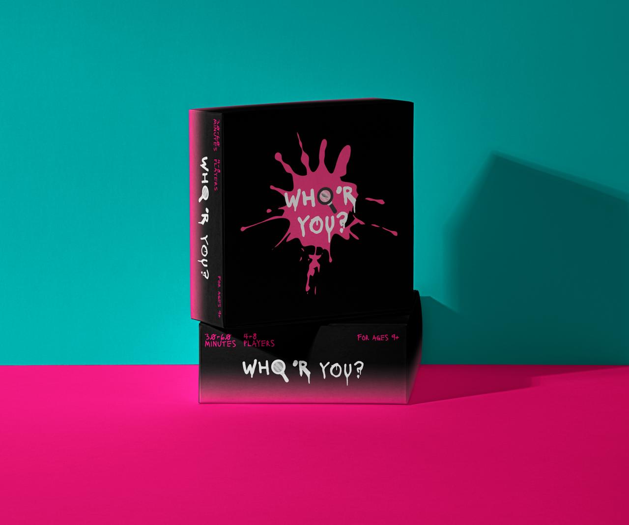
Finally, we settled on this as our logo.

Figure 6.3.4 Logo Revision 6
6.3. Board Revision
For the board, we commented that the board might look too colorful and happy-like for the concept in the previous design. Hence, Graciella came up with the idea that the board should also have blood stains and include a dark color in the center to add eerieness. Graciella made several alternatives for the board.


Figure 6.3.1 Board Revision Drafts
After seeing the design of the information booklet, I suggested that the center could also have the cover design of the booklet because I thought it was very eye-catching.

Figure 6.3.1 Final Revision Drafts
6.4. Role Card Revision
Figure 6.4.1 Character Illustration
First of all, I needed to redraw the characters. I planned on drawing characters that can show the diversity in Malaysia.
I remade the layout of the player card because the previous one was too similar to Squid Game. My Initial idea for the layout is to make a case profile that is usually used in crime investigation. So I come up with an idea to put the characters in Polaroid.

Figure 6.4.2 Role Card Layout Drafts
After consulting with my teammates, Figure 6.4.2 is the final layout that we all agree on.

Figure 6.4.2 Chosen Role Card Layout
Then, they also suggested applying blood stains so that the card would look more creepy and add consistency to the board design.

Figure 6.4.2 Back Cover Revised
Finally, I applied all the other characters and added their descriptions. I made the description to be as general as possible so that the players can't ask questions that can immediately describe the suspect. The description includes gender, ethnicity, age, and employment.

Figure 6.4.2 Role Card Draft
6.5. Minigame Card Revision
Seoyoon revised the minigame cards, making the background dark and adding the blood stain to make them seem more creepy and eerie.

Figure 6.5.1 Minigame Card Revision
6.6. Instruction Booklet
Figure 6.6.1 Instruction Booklet Draft
6.7. Deliverables
Packaging Mockup
Minigame card Packaging mockup
Board Mockup

Other Deliverables
7.1 Week 7
From the suggestions given by Ms. Vitiya and Ms. Anis, we made more revisions for everything (can be seen in the Feedback section).
7.2 Logo Finalization
This is the final logo that we agreed on, digitalized by Carmen. We decided that the magnifying glass would surround the text and we added the effect when the letters are zoomed by the magnifying glass.
7.3 Player Card Finalization
I tried different layouts of the mugshots as suggested.

This is the top 3 layouts that I think are okay. I consulted with my teammates and they chose the middle one.

I illustrated the characters again so that they have bloodstains and I also illustrated their hands so they look like they are holding their description.

7.4 Minigame Card Finalization
For the Minigame, Seoyoon added dirty paper texture and realistic blood stains to the cards.

7.5 Board Finalization
Same as the Minigame cards, Graciella added dirty paper texture and a more realistic blood stain to the board to keep the consistency.

7.6 Information Booklet Finalization
For the Information booklet, Seoyoon made the writing per line shorter and made the design similar to the rest of the designs
7.6 Deliverables Finalization
Mascots


Minigame Card Mockup
.jpeg)
Cafe Mockup

Store Board Mockup


Poster Design and Mockup


FEEDBACK
Week 4
This week, there was a lot to be improved. Ms Vitiya reminded us that we have to have a consistent style. meaning we needed to decide on the Font style for the whole product, the color palette, and the style of the illustration. When Ms Vitiya saw the sketch of the minigame card and the board game, she said that the illustration did not look consistent because there were some that looked like images, some looked like vectors, and some looked like icons. Then she suggested going with a 3D style that still has a cartoonish effect.
Aside from that, she also reminded us to decide on our deliverables. She reminded us that in Major Project 2, we only have time to execute the project. Hence, we need to finalize our planning in this semester. We need to decide on the design of our exhibition. For instance, the banner, poster, plinth, and how we want to show the product.
Week 5
This week, we consulted with Ms Vitiya and Ms Anis. They both felt like our project was leaning too much toward Squid Game. They suggested if we go with this path, it might look like we are ripping Squid Game off. Ms Anis suggested that we also reference Malaysian culture because there are also a lot of traditional games that are similar to the Korean Games in Malaysia. She also suggested that the characters in the role card can be typical Malaysian citizens such as Grab Drivers, Abang Mamak, etc.
For the Logo, they said that there was too much going on. Because it is lengthy, it might be hard to apply the Logo (Figure ). The use of multiple colors would also make it hard if it has to be applied in a design with the same color. The name of the game is also hard to read, not a lot of people can catch the name "whodoythinkur", they might not read it as "Who do you think you are".
Week 6


Player card consultation
The first thing that we discussed with Ms. Vitiya and Ms. Anis is the player cards. Ms. Anis said that it was a lot better than the previous design but Ms. Vitiya thinks that the layout of the player cards is too stiff. It felt like the character was not a part of the whole card. She suggested we make it as if the characters are in a mugshot to show that everyone is suspected. She made a sketch explaining the description is places in the paper that are usually held in a mugshot and she also suggested putting less of the border so the card's focus is mostly on the characters. She also said that the characters looked too clean for the concept. With that, I decided to add blood stains in all of the character illustrations.
Logo Consultation
For the logo, Ms. Anis thinks that the placing of the "Who" beside the "R" makes the writing resemble an inappropriate word. Hence, she suggested putting them in the second line of the logo. Then Ms. Vitiya helped us by sketching alternatives for the logo. We liked the Idea of the magnifying glass overlapping the whole letter.
Board, Packaging, Minigame card Consultation
Ms. Vitiya thinks that the blood stains in our designs look more like splashed paint rather than blood. She said that we should use dried blood texture instead. She also thinks that some of the designs looked too clean. She suggested using dirty paper textures.
Booklet Consultation
Ms Vitiya reminded us of the rules of typography, one line must only consist of 12 words. She suggested shortening the line in the instruction booklet so that people won't feel lazy to read it.
SUBMISSION
Design Preposition
REFLECTION
This part of making the Project felt the longest and the most tiresome because me and my teammates had to go through a lot of revisions. But in the end, we all managed to make all of the things we needed in this project. Just as I expected, I learned a lot of new skills from my teammates which made me very grateful. I and my teammates also learned a lot about how to create a product or a brand identity. Along the line, we realized we need to consider the consistency of our work and since we are working as a team, it is more challenging. We tried our best to keep each other updated on our progress and let each other give critiques and suggestions with no hard feelings.


Comments
Post a Comment